Trump’s Inflation Claims Clash With Voters’ Cost-of-Living Reality
  Bank of Japan Signals Readiness for Near-Term Rate Hike as Inflation Nears Target
  Thailand Inflation Remains Negative for 10th Straight Month in January
  India–U.S. Interim Trade Pact Cuts Auto Tariffs but Leaves Tesla Out
  South Africa Eyes ECB Repo Lines as Inflation Eases and Rate Cuts Loom
  U.S. Stock Futures Slide as Tech Rout Deepens on Amazon Capex Shock
  Trump Endorses Japan’s Sanae Takaichi Ahead of Crucial Election Amid Market and China Tensions
  Dollar Steadies Ahead of ECB and BoE Decisions as Markets Turn Risk-Off
  Vietnam’s Trade Surplus With US Jumps as Exports Surge and China Imports Hit Record


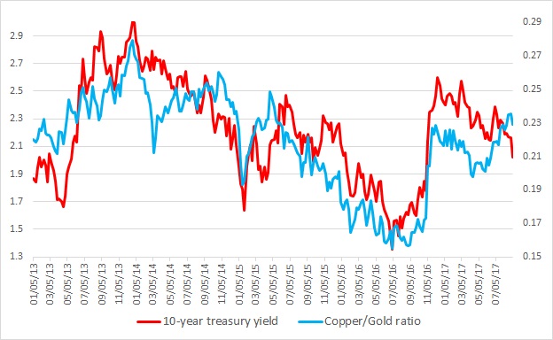
This chart shows the relation between the copper/Gold ratio and the U.S. 10-year yield constant maturity since 2013. It is visible even with the naked eye that the ratio and the yield have enjoyed a close relationship. Any divergence was temporary.
Last major divergence occurred back in 2014 when since March that year the ratio moved higher while the yield continued its decline. This continued until October before the collapse took place beginning November of that year.
What is the significance of the ratio?
- Copper is considered as an industrial barometer and pro-growth, while gold is considered as a safe haven and anti-growth. So higher ratio usually indicates increased economic activities, which in turn leads to higher interest rates/yield. Back in 2014, the ratio moved higher anticipating better than expected growth while yield moved higher but the ratio collapsed as the economy slowed down. Even the U.S. Federal Reserve had to lower its rate forecast.
Warning sign:
- A divergence is ongoing since April. The ratio has been moving higher while the yields are moving down. So the question is, how the divergence might end – higher yields or economic collapse.