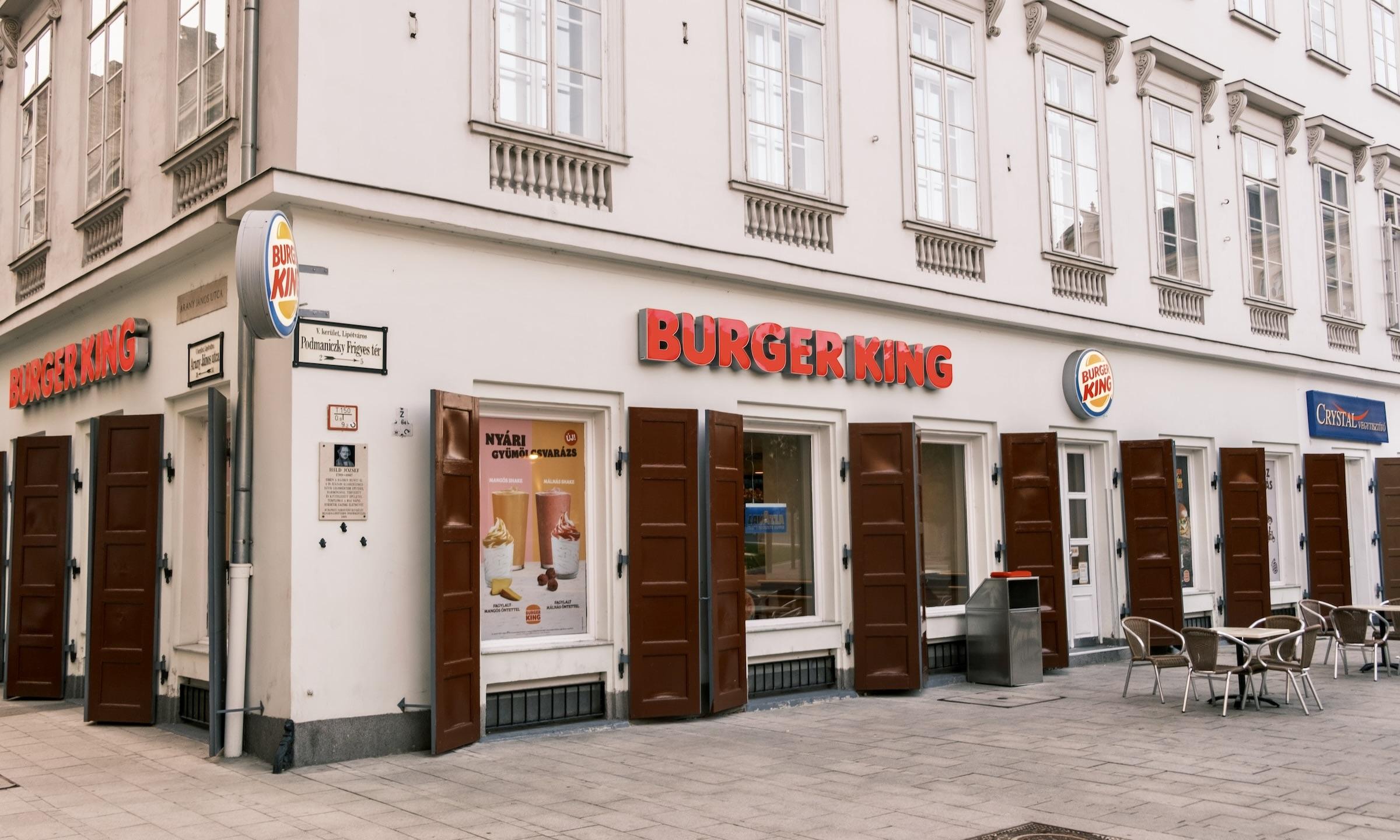
Burger King, the home of Whopper Burgers, has debuted a new restaurant design named "Sizzle." Unveiled at the annual franchisee convention, this initiative marks a significant phase in the company's rejuvenation efforts.
Burger King's new "Sizzle" restaurant design concept was unveiled by Tom Curtis, the president of the chain's U.S. and Canada units, during the company's annual franchisee convention, which took place last week.
Burger King's Store Design for the Future
Daily News reported that the fast-food chain is adding more digital ordering kiosks and dedicated pick-up spaces and redesigning its drive-thru to make it more efficient. The brand is making all of these changes as most of its rivals have already made similar modifications to shorten waiting times for customers and increase the number of customers since the services will be faster and more efficient now.
The new interiors of Burger King were described as "very warm and inviting." Unlike in the past, tables in the dining areas are of different sizes. The company also added more booths and chairs, which are more comfortable. The walls and ceilings were decorated with BK slogans and fast food-themed art, such as hamburger-inspired lighting and French fry wall decor.
Store Locations of Remodeled Outlets
As of now, Burger King has two locations already renovated for the "Sizzle" upgrade. These stores are located in Las Vegas and New Jersey. A third outlet is set to open in North Carolina before this month ends.
Meanwhile, CNN Business reported that Burger King has been working on its recovery for more than a year now, and after the "reclaim the flame" campaigns, the renovations are the next step in the scheme. Last year, the company announced its $400 million investment to improve its business. BK is also spending $250 million for the remodeling of its restaurants.
Photo by: Marquise de Photographie/Unsplash


 Pershing Square Raises $5 Billion in Landmark U.S. IPO and Share Placement
  Can your cat recognise you by scent? New study shows it’s likely
  Qualcomm Stock Surges Despite Weak Guidance After Q2 2026 Earnings Beat
  U.S. Cybersecurity Pushes Faster Patch Deadlines Amid Rising AI-Driven Threats
  Asian Stock Markets Rise Amid Wall Street Rally and U.S.-Iran Tensions
  US Stock Futures Rise as S&P 500 and Nasdaq Hit Record Highs Amid Earnings Optimism and Iran Tensions
  The Beauty Beneath the Expressway: A Journey from Self to Service
  Heritage, desire and diplomacy: why China still values scotch whisky
  The pandemic is still disrupting young people’s careers
  The ghost of Robodebt – Federal Court rules billions of dollars in welfare debts must be recalculated
  EU Warns of Response as U.S. Considers 25% Tariffs on Car Imports
  Amazon Stock Dips Despite Record Earnings as AI Infrastructure Spending Surges
  How to support someone who is grieving: five research-backed strategies
  Wall Street Surges to Record Highs Amid Strong Earnings and Economic Stability
  Oil Prices Rise Amid Iran Conflict and Strait of Hormuz Disruption


