Stuck in a creativity slump at work? Here are some surprising ways to get your spark back
  The Beauty Beneath the Expressway: A Journey from Self to Service
  Yes, government influences wages – but not just in the way you might think
  Why financial hardship is more likely if you’re disabled or sick
  Heritage, desire and diplomacy: why China still values scotch whisky
  The American mass exodus to Canada amid Trump 2.0 has yet to materialize
  Time to buy local: war fuel price shocks reveal the folly of a long food supply chain
  What’s the difference between baking powder and baking soda? It’s subtle, but significant
  Disaster or digital spectacle? The dangers of using floods to create social media content
  Can your cat recognise you by scent? New study shows it’s likely
  The ghost of Robodebt – Federal Court rules billions of dollars in welfare debts must be recalculated
  The pandemic is still disrupting young people’s careers
  Debate over H-1B visas shines spotlight on US tech worker shortages
  Glastonbury is as popular than ever, but complaints about the lineup reveal its generational challenge
  How to support someone who is grieving: five research-backed strategies
  Columbia Student Mahmoud Khalil Fights Arrest as Deportation Case Moves to New Jersey


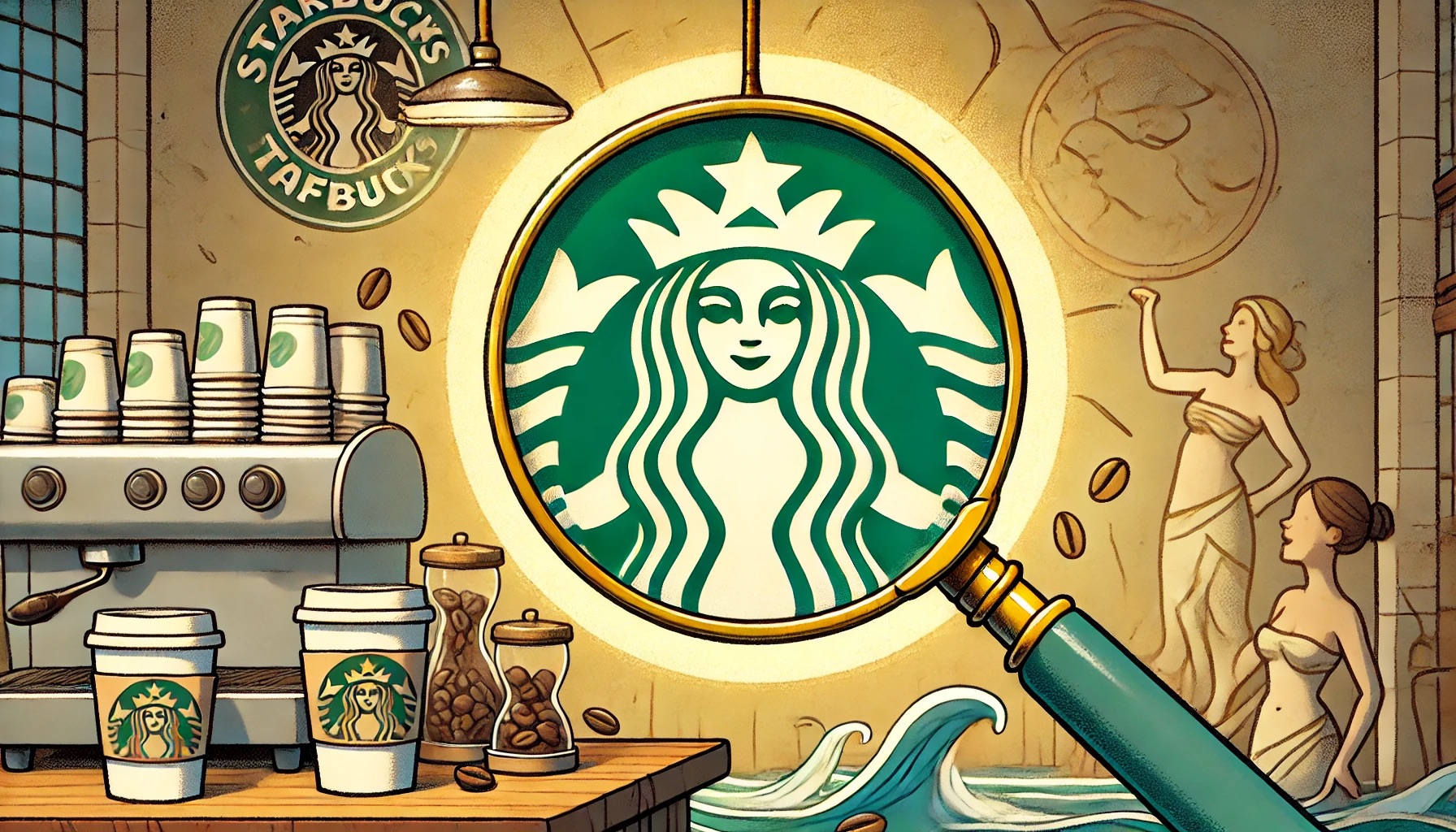
The Starbucks logo is instantly recognizable, but there’s a hidden detail many overlook—the Siren’s face isn’t perfectly symmetrical. In 2011, Starbucks intentionally introduced a slight imperfection to make the logo more approachable, adding depth and relatability to its global brand.
Starbucks' Iconic Siren Logo Hides a Subtle Imperfection, Enhancing Its Unique Allure and History
The Starbucks logo is one of the most recognizable symbols in the world, greeting millions of coffee enthusiasts each day. But most people overlook a subtle secret hidden within this iconic emblem. While the Siren’s face appears symmetrical at first glance, a closer inspection reveals a fascinating imperfection that adds to the logo’s uniqueness.
Since its creation in 1971, the Starbucks logo has evolved multiple times. The original design featured a brown, double-tailed mermaid, or Siren, inspired by nautical themes and Herman Melville’s Moby Dick. In 1987, the company introduced the now-familiar green color, and by 1992, the logo had been modernized as Starbucks went public. However, the most significant transformation came in 2011, when the words “Starbucks Coffee” were removed, leaving Siren as the focal point.
The Siren is more than just an emblem of beauty—she represents the seductive allure of coffee, drawing customers in much like the Sirens of Greek mythology lured sailors to their fate. As Starbucks expanded beyond coffee, the company sought to evolve the Siren to reflect its broader offerings and global reach.
Starbucks' Subtle Asymmetry: How a Small Flaw in the Siren Logo Created a Deeper Human Connection
In 2011, the global branding team at Lippincott, tasked with redesigning the logo, wanted the Siren to convey confidence, allure, and approachability. Initially, they crafted a perfectly symmetrical, flawless version of the Siren’s face. Yet, something felt wrong. “She was uncannily beautiful, a bit creepy, to be honest,” explained creative director Connie Birdsall. The perfect symmetry gave the Siren an unnatural, robotic appearance.
To humanize the Siren, the team introduced a slight imperfection. "The imperfection was important to making her successful as a mark,” said Birdsall. If you look closely, you'll notice that the right side of the Siren's face is subtly different from the left. Her nose dips slightly lower, and the right side is shadowed more. This small but significant asymmetry makes the logo more inviting and relatable.
Design partner Bogdan Geana highlighted how this subtle flaw made the Siren feel “a bit more human” and less like a "perfectly cut mask." The decision to embrace imperfection went against the conventional wisdom that beauty lies in symmetry. However, the Starbucks team realized that adding this asymmetry would make the Siren more approachable and warmer, fostering a stronger emotional connection with customers.
At the same time, Starbucks removed the words "Starbucks Coffee" from the logo. By 2011, the Siren had become so iconic that the company no longer needed text to convey its identity. This move also allowed Starbucks to expand beyond coffee, offering a more comprehensive range of products, from breakfast foods to evening snacks and beverages.
Next time you hold a cup of Starbucks coffee, look closely at the Siren. Her subtle asymmetry reminds us that perfection isn’t always the key to connection. Instead, thoughtful imperfections make the logo—and the brand—feel more human and approachable. This hidden detail isn’t just a design quirk but a testament to the power of intentional, relatable branding.