With Iran and the US signing a peace deal, where does that leave Benjamin Netanyahu?
  How AI prompting turned writerly description into an everyday skill
  SpaceX Stock Gets $175 Target as Analysts See Massive Growth Ahead
  China’s AI Manufacturing Boom Masks Weak Consumer Economy, Citi Says
  J.P. Morgan Sees Potential Vestas Guidance Upgrade Amid Strong Wind Energy Demand
  Trump’s Iran Strategy: What Has Been Achieved After Three Months of Conflict?
  Goldman Sachs: US Dollar Likely to Stay Strong Despite Oil Price Retreat
  AI Memory Boom Sparks Global Chip Supply Crunch


Air pollution is an unseen menace that poses a major threat to human health and the climate. We have created the air quality stripes, a visual tool that captures global air pollution trends, to bring this hidden threat into sharp focus.
Inspired by professor of climate science Ed Hawkins’ climate warming stripes, the air quality stripes depict particulate matter (PM) concentrations in 176 cities worldwide since 1850. These tiny particles, often smaller than one-30th of the width of a human hair, can penetrate deep into the lungs, posing serious health risks.
By making air pollution more visible, the stripes provide a clear way to understand how air quality has evolved over time across different regions.
These new stripes reveal a stark contrast between significant improvements in air quality across Europe and alarming deterioration in parts of Africa and central Asia. Cities like London, Brussels and Berlin are represented by lighter blue stripes, indicating substantial reductions in PM levels. This progress reflects stricter air quality regulations and advancements in reducing emissions.
Conversely, cities in central Asia and Africa, such as Islamabad, Delhi and Nairobi, are depicted by darker hues, reflecting a worrying rise in pollution. Rapid urbanisation, industrial growth and limited regulations are worsening air quality issues in these regions, while people living in poorer areas are often exposed to higher concentrations of pollution.
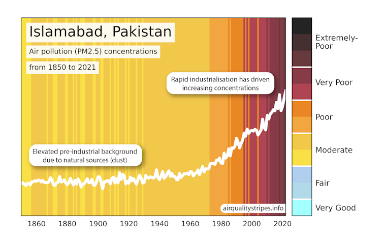
Darker colours represent higher levels of particulate matter known as PM. https://airqualitystripes.info/, CC BY-ND
In 2021, the World Health Organization issued new guidelines for air quality, revealing that over 99% of the global population lives above recommended levels. The air quality stripes clearly outline the urgent need for targeted international efforts to address this pollution crisis.
Creating the air quality stripes involved more than just illustrating trends – it involved capturing the complexity of air pollution. PM originates from both natural and human-made sources.
Natural contributors, such as desert dust, wildfires and volcanic activity predate the industrial revolution. Human activities like industry, agriculture and vehicle emissions are significant contributors, particularly in urban areas.
We observed the influence of natural sources in certain regions. For example, coastal cities like Jakarta show lower particulate levels than expected, likely due to sea breezes. Conversely, regions near deserts or with frequent wildfires often show higher PM concentrations, reflected by darker stripes.
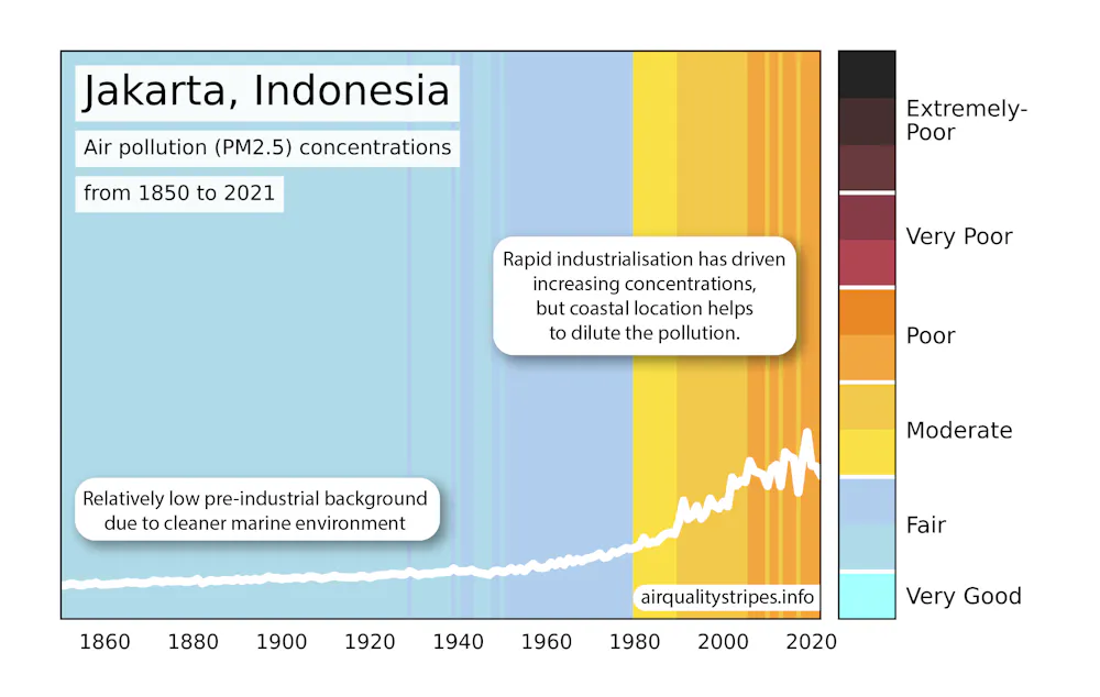
Coastal cities like Jakarta show lower concentrations of PM air pollution. https://airqualitystripes.info/, CC BY-ND
Between 1990 and 2021, deaths caused by PM increased by 93%. As other factors affecting mortality improve, air pollution becomes an increasingly critical issue.
One compelling aspect of the air quality stripes is their historical reach. We combined data from computer simulations and satellite observations to estimate PM concentrations back to the industrial revolution. This long-term perspective is crucial for understanding how human activity has shaped air quality over the centuries.

The Houses of Parliament, Sunset, by Claude Monet (1903). Impressionist paintings like this highlight the limitations of early air quality records. Everett Collection/Shutterstock
However, this historical analysis presented challenges. Early data is sparse and often anecdotal. For instance, we drew insights from an analysis of Claude Monet’s paintings, which depict the smog-laden skies of London in the late 19th and early 20th centuries.
These artistic interpretations provide valuable context but also highlight the limitations of early air quality records. While we now have literally millions of observations from satellites detailing levels of pollution and the weather patterns that transport them around the world, these are only relatively recent.
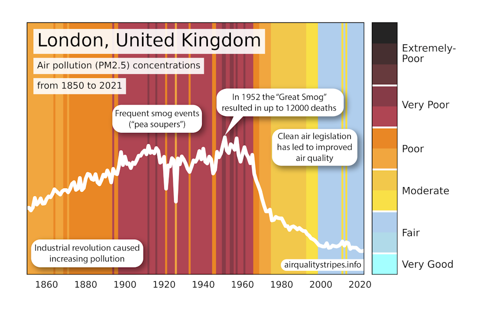
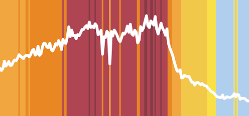
The effects of smog events and the industrial revolution are clearly visible on the air quality stripes for London. https://airqualitystripes.info/, CC BY-ND
For early data points, we have to rely upon historical emissions inventories as starting points to estimate annual PM concentration profiles. These databases are used to simulate the current generation of climate models.
The colour of pollution
A key challenge was choosing a colour scheme that accurately represented the data. We chose a gradient from light blue to black. Light blue represents clean air, while black indicates high levels of pollution. We collaborated with a visualisation expert, Ethan Brain, who analysed more than 200 online images with the “air pollution” tag to identify the most appropriate colour palettes.
The resulting visual tool is both scientifically accurate and easy for everyone to understand. Richard Rigby, a research software engineer from the Centre for Environmental Modelling and Computation at the University of Leeds, helped bring the stripes to life through an interactive website. The stripes distil complex data into a format that is instantly recognisable, helping to raise awareness about the global state of air quality.
The air quality stripes are more than just a data visualisation. They are a call to action. By making air pollution visible, we hope to highlight progress and confront ongoing challenges. The stark contrasts between regions remind us that there are major environmental inequities. While some parts of the world are breathing easier, others face an increasingly toxic environment.
The transition to net zero hinges on moving away from using fossil fuels for transport and power generation. That will also dramatically improve air quality.