Houthi Attacks on Saudi Oil Sites Raise Fears of Wider Middle East Conflict Despite U.S. Strike Pause
  US-Mexico USMCA Talks Advance as Auto Rules Remain Major Sticking Point
  Iran Rejects U.S.-Backed Ceasefire as Trump Escalates Military Threats, Oil Tops $100
  Asian Stocks Slide as Oil Tops $100, Middle East Conflict Fuels Inflation Fears
  Asian Stocks Rally on AI Spending Optimism as Middle East Tensions Push Oil to Six-Week High
  Canada Opens Gordie Howe Bridge Without U.S. Officials as Trump Tariff Tensions Persist
  Oil Prices Head for Weekly Surge as Red Sea Attacks and Kazakhstan Supply Cuts Raise Disruption Fears
  Canada Vows Trade Fight as Trump Imposes 50% Tariffs
  Trump Administration Imposes New Forced Labor Tariffs on 60 Trading Partners
  Japan Manufacturing Growth Holds Strong in July Despite Middle East Uncertainty


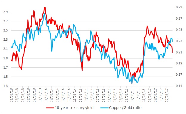
This chart shows the relation between the copper/Gold ratio and the U.S. 10-year yield constant maturity since 2013. It is visible even with the naked eye that the ratio and the yield have enjoyed a close relationship. Any divergence was temporary.
Last major divergence occurred back in 2014 when since March that year the ratio moved higher while the yield continued its decline. This continued until October before the collapse took place beginning November of that year.
What is the significance of the ratio?
- Copper is considered as an industrial barometer and pro-growth, while gold is considered as a safe haven and anti-growth. So higher ratio usually indicates increased economic activities, which in turn leads to higher interest rates/yield. Back in 2014, the ratio moved higher anticipating better than expected growth while yield moved higher but the ratio collapsed as the economy slowed down. Even the U.S. Federal Reserve had to lower its rate forecast.
Warning sign:
- A divergence is ongoing since April. The ratio has been moving higher while the yields are moving down. So the question is, how the divergence might end – higher yields or economic collapse.